

#15 Beyond the Brief: Pulling Levers and How Color Tells a Story

Us photographers and cinematographers, and really anyone in the visual arts, see the world differently, literally.
It’s something any visual artist works hard to develop, and it’s not something that you can just turn off. You walk in a room and start thinking about angles, perspective and lighting. Every landscape becomes a composition waiting to be found. Lines, shadows, depth, where the light is falling and where it isn't, the angle that gives character versus the one that is anticipated. Most people walk through the world. Some of us are constantly reframing it.
We may be a quirky bunch at times but really it's the foundation of everything that ends up in a final image.
Last fall we had a production for a client shooting military uniforms. Solid project, great light all day, strong golden hour at the end. I did my normal post production editing and color grading thatI had developed with the client over the years. Clean highlights, good contrast, detail in the shadows and just a bit of edge to the images to make them feel gritty white still staying true to the garments color. All wrapped up, approved, delivered and invoiced. Pretty standard project.
A few months ago I was updating some portfolios and came across these images and took a second look. I started to rethink them and play around a bit. What if I pulled everything down, shifted the color, and pulled the saturation down, crushed the blacks more and increased the contrast?
Same image, completely different story and world.


What had been a perfectly good clean lifestyle image was now darker, moodier and felt a way the other image never did. Neither way is wrong, just different. That's the fun of understanding the levers you can pull to create a mood or feeling and do it deliberately rather than just reaching for the default settings.
Lighting, shutter speed, color temperature, aperture, lens selection, these are all decisions made before we get to the post production and how you color grade can reflect different decisions. This isn’t a “fix it in post” decision, these are the finishing touches that bring your vision to life. What you do in post during retouching and color grading doesn’t fix bad lighting, out of focus images or bad composition. These levers can only work when a good foundation is there.
The craft and my own personal vision is one side of things, the brand side is something completely different.
Every brand has a visual language, some are very loose with it, some have guidelines clearly spelled out and if an image doesn't follow these guidelines, it’s on the chopping block. Some are vibrant and direct or muted and atmospheric. Some want to be gritty and real while others tend to stay warm and approachable. Part of our job from the very beginning is understanding what that language is and making sure everything we deliver follows their path. If we stray too far from where a brand lives, it will not only show, but we will have missed the mark regardless of how great that image may be on its own.
What we can do is bring our eye and experience into those guidelines. There’s a fine line between executing a brand’s vision and contributing something new creatively to it. This is all something that is discussed way before the production day and is talked through so there are no surprises when we get to set.
Now I’ve been doing a lot of the post production for my photography for years, video…that’s a whole different beast. The more I dove into color grading video and talked with real colorists who knew the nuances and how to make it come to life, the more I realized I didn’t need to take that on as well. Way more levers there to play with. Thankfully I have a few really talented colorists I work with that can really make our projects come to life and match the feeling we describe and match the photography. Finding this talent is really the difference between delivering the expected and delivering the exceptional.
Now here’s the thing I want people to know who are looking at my work, especially if you’re looking to hire us.
The work a photographer/cinematographer gets paid to do tells you what they can execute and how they could bring your ideas to life. Their personal work tells you who they are.
I have a series I’ve talked about before called The Ground Glass Project. This project has nothing to do with the ag, industrial or the majority of the work I do on a regular basis. It’s a portrait series using a 100 year old camera and completely different from anything else on my website.
So why is it there?
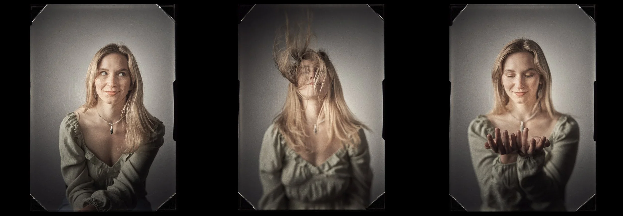
What this project shows is the love of the craft of photography and of working with people while taking the time to create a meaningful portrait of them that hopefully stands the test of time. This project is also the gateway to finally getting everything together to start making tintypes, which is one of the earliest forms of photography from the mid 1850’s.
When you come across creatives that can do the commercial work for major brands, but also take time to stay devoted to their craft, you find a developed eye and talent. That’s where we see this as more than just a job.
So when you look at anyone's work and you see not only the polished portfolio or show reel, but also see something more rooted and personal, you should look at both sides of the coin. The professional work shows you they can deliver. The personal work shows you why they do it and where their heart is as an artist and creative. When you find both, it’s worth holding onto.